
mwo.pl - website audit
mwo.pl is the website of a store that sells customized window coverings. The task was to find design flaws that make it difficult for users to browse the content and shop efficiently.
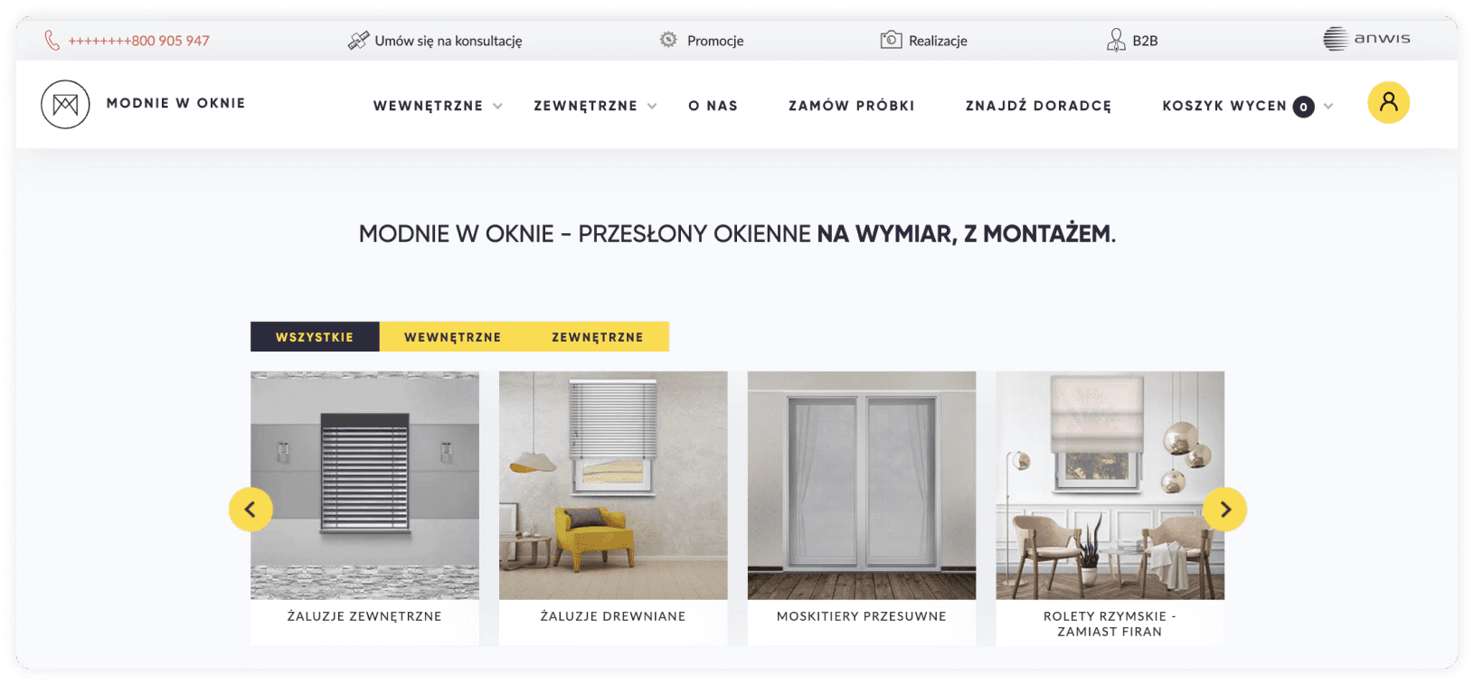
Website navigation
Critical error
Functional
Conceptual
The main navigation is clear, but above the navigation you can see a bar that can confuse the user. The bar shows as many as 6 additional elements - including key features of the site, e.g. Make an appointment for a consultation, promotions. It is worth considering the hierarchy of the navigation and highlighting the most interesting elements for the user. In the main navigation, the categories next to which you see an arrow (dropdown) have a hover, which doesn't quite do the job, because the padding when you expand the dropdown should fill the page to its full width, so that there are no accidental clicks or disappearance of the navigation.

Nonstandard hero image
Serious error
Functional
Visual
The store loses a lot by not having a Hero Image at the top of the page. There is no place to promote a selected product/products or refer the user with a CTA button to an important place on the page. Hero Images let the user know what content they will find when browsing the site. The Hero Image should include an H1 header, which defines the hierarchy of the text and has SEO implications.
CTA Buttons
Serious error
Functional
Conceptual
Visual
3 types of CTA buttons that visually have the same hierarchy. No secondary button. As many as three colors used in the buttons.
Iconography
Serious error
Visual
There is a noticeable inconsistency in the graphic characters present on the page. Some icons are practically invisible.
Contrasts
Critical error
Functional
Visual
Contrasts on the site are not compliant with WCAG 2.1 standards.
Typography
Critical error
Functional
Visual
There is no visible text hierarchy in some places. The body text may be hard to read for some people, as its size is 10.2p. The button text is only 9p. The minimum size should be 12-14p. The site contains as many as 3 different sans serif fonts.
For example, the text above is only 10p, the contrast value also does not comply with WCAG standards. This also affects the positioning of the page.